Client Project
Travous:
Collaborative Group Travel Planning App
Travous:
Collaborative Group Travel Planning App
Overview
Travous is a collaborative group travel planning app designed to simplify and streamline every stage of trip organization. By centralizing itinerary creation, group coordination, and essential travel logistics, Travous minimizes planning hassle and maximizes the enjoyment of traveling together. With powerful tools for itinerary management, sharing, and personalization, the platform provides a frictionless way for groups to create memorable journeys tailored to everyone's preferences.
Project Type & Involvement
work for Travous - User Research, UX/UI Revamp
Timeline
October - November 2024
Platform
iOS
My Role
Research: Analyzed market competitors and gathered real user feedback to identify core pain points and user needs for group travel planning.
Design Revamp: Redesigned the login, signup, and every itinerary screen. This involved rethinking the flow, visuals, and interaction patterns to streamline task completion while maintaining enjoyment for users.
Brand System: Established a refreshed visual identity and custom illustration style to unify the Travous brand across all itinerary-related touchpoints.
User Experience Optimization: Simplified navigation, reduced friction, and improved clarity throughout the journey planning experience to encourage ongoing engagement.
Objective
Deliver a fully integrated, easy-to-use group itinerary planning solution
Reduce user confusion and drop-off at every stage, not just onboarding
Raise the overall brand perception through a modern, engaging design
Provide all necessary tools for comprehensive, collaborative travel planning
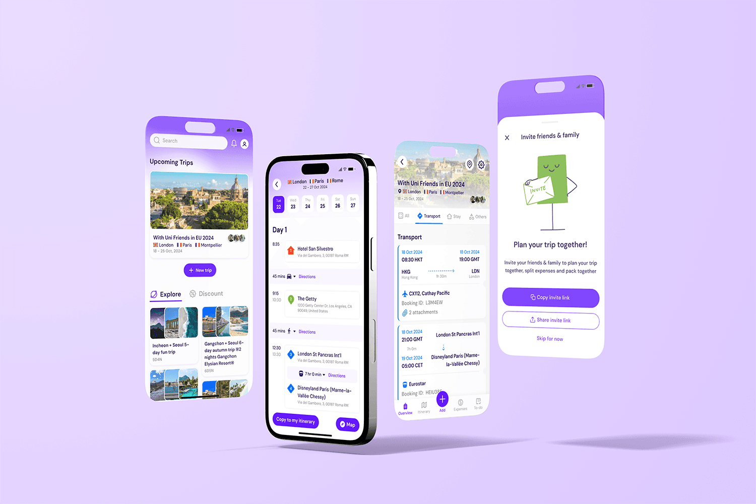
Core Features (Itinerary & Planning)
Trip Creation & Smart Templates
Browse & Copy Templates: Users can explore a library of itinerary templates and select one that fits their needs, then easily copy and adapt it for their trip.
AI-Assisted Customization: Users may start from scratch or let the app generate an itinerary based on preferences such as location, trip duration, family status, and desired pace etc
Flexible Editing: After choosing a starting template, every aspect of the trip remains editable. Users can add travel documents, modify stays or transport, and adjust any detail independently or collaboratively.
Single Trip Overview & Management
Itinerary Editing: Each trip features detailed sections, allowing users to:
Places: Save, organize, and prioritize must-see destinations.
Transport: Enter, update, and manage all travel arrangements.
Stay: Save and adjust accommodation details as plans evolve.
Travel Documents: Upload and store essential documents for quick access.
Explore: Discover curated recommendations for activities, landmarks, and dining options based on destination.
Collaboration & Social Features
Group Planning: Invited participants can join trips, contribute, and keep plans up to date.
Likes & Voting: Members can vote on places or activities, making it easy for groups to reach consensus on what to see and do.
Sharing: Trips, favorite places, and finalized itineraries can be shared, saved, or marked as favorites for easy access and inspiration for future adventures.
Visual Trip Mapping
Map Scenes: Integrated maps visually display every stop on the trip, clearly indicating the route and order of visits (first, second, third, etc.), helping users understand and optimize their travel flow at a glance.
User flow Diagram
Designing the user experience began with sketching out a typical user journey based on completing specific tasks within the app, using different colours to indicate various actions.

Design System
A design system was created for each operating system incorporating the set of visual elements like colour, typography and UI components.

Components
A comprehensive component library was created, consisting of various UI elements such as buttons, and navigation components, ensuring consistency and usability throughout the interface.


Illustrations
Designed custom illustrations featuring character-like figures that reflect the client’s preference for a cute and welcoming style, enhancing the app’s overall friendly and approachable visual identity.

MVP
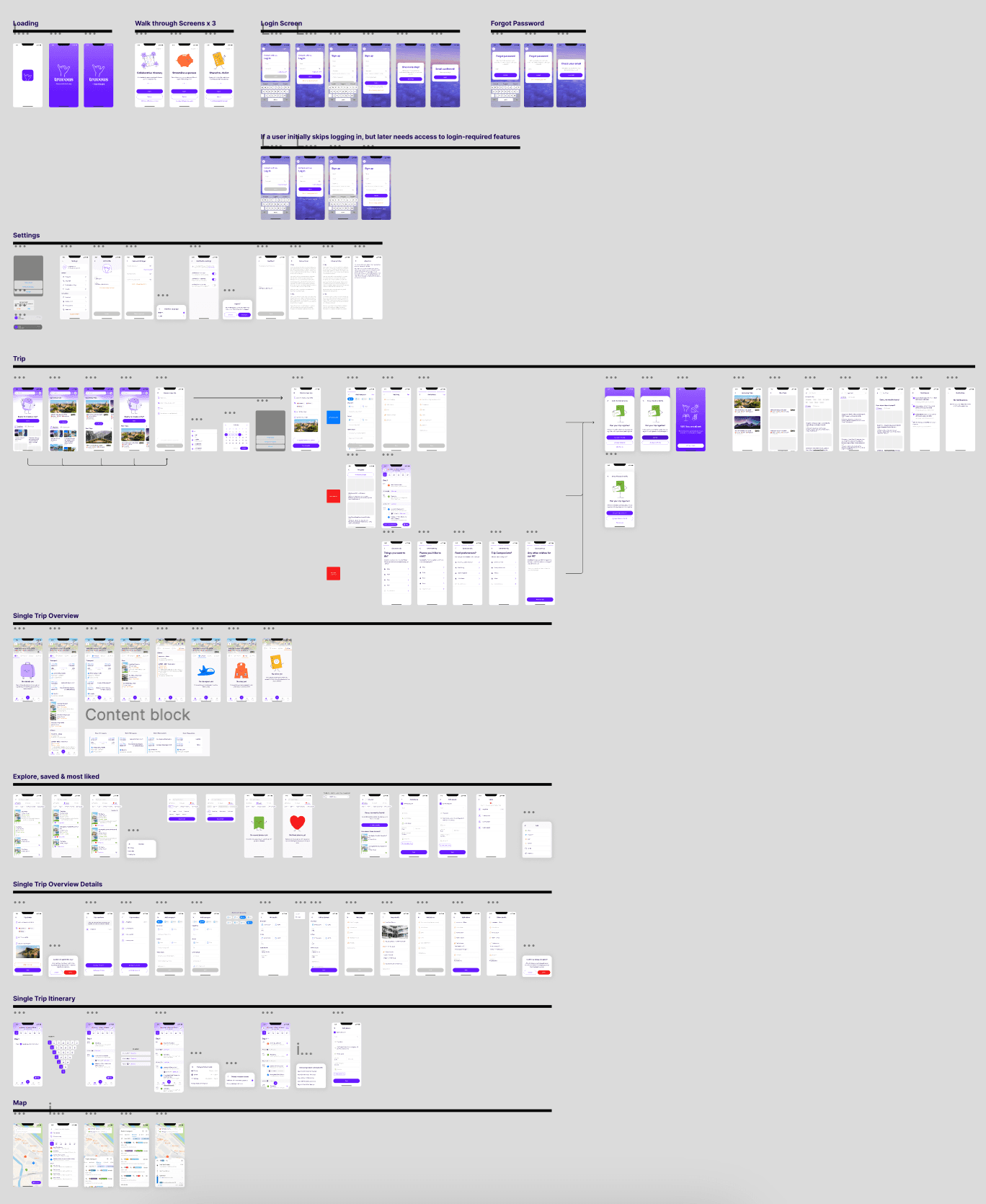
Final Design Preview
Learnings & Reflections
As someone who’s passionate about travel—and an MBTI “J” who naturally gravitates toward detailed planning—this project was a perfect intersection of my interests and my UX/UI expertise. Before working on Travous, I was already deeply involved in planning my own trips, but I rarely relied on dedicated travel apps. My own experience, as well as initial user research, highlighted that many people also default to using a mix of Notion, Excel, Google Maps, and other tools to build their itineraries, mainly because these platforms offer flexible ways to brainstorm and dump ideas. However, these tools often lack a coherent and enjoyable user journey, something I was eager to address with this redesign.
From the very beginning, I explored popular travel and itinerary apps across different markets to understand both effective flows and common points of user frustration. I discovered that while some apps try to do too much and create confusion, others are overly restrictive. This insight inspired me to strike a balance—crafting interfaces that are visually inviting and playful, while also communicating information clearly through iconography and concise layouts.
One key learning was acknowledging that users, especially when traveling, don’t want to waste extra time figuring out how the app works or realizing mid-trip that a feature isn’t helpful. The challenge was to keep the flow direct and intuitive, so users always know their next step and where they should go in the app. Simplifying navigation and limiting information overload became design priorities.
Additionally, reflecting my love of collecting and organizing information, I learned how small cues or extra hints—like onboarding tooltips or playful micro-interactions—can make a big difference, especially for first-time users. Even within the short timeframe of this project, focusing on concept clarity rather than adding unnecessary features resulted in a cleaner, more enjoyable planning experience. Throughout the process, I found new ways to present complex, collaborative journeys in a manner that’s both accessible and genuinely engaging for all kinds of travelers.
Overview
Insights from Saadhana will be utilized in the development of a dedicated application tailored to both creators and listeners of wellness content.
Listeners will have the ability to personalize their practices by customizing playlists and content, incorporating various disciplines. Creators will benefit from additional revenue streams by uploading their content to other streaming services, thereby expanding their reach. Introducing "PRACTICE: Your Personal Guide to Wellness," an app designed to enhance your well-being.
Project Type & Involvement
work for Saadhana - User Research, App Design
Timeline
1st - 26th August 2023
Platform
iOS
My Role
I collaborated with Xccelerate’s coursemates to develop interview questions and conducted interviews. I focused on creating user journey maps and affinity maps based on the interview results, gathering valuable insights. With my teammates Tiffany Poon, Vicky Chung, and Adrian Luk, we discussed the business angle and determined three core features to make our app stand out. I played a key role in designing and aligning the visual style and spacing for the high-fidelity prototypes. We conducted usability tests and made necessary adjustments based on feedback. Finally, we presented our findings and implemented the recommended changes.
Project Flow at a Glance
Research
Define
Ideate
Refine
Usability Test
Prototype
User Interviews
Objectives
User needs assessment
Other apps user experience, satisfaction, App design (UI&UX)
Content Curation
Tasks
Answer approximately 13 questions and share any additional information they would like to contribute
Details
Total sessions
15
Interviewees
9 yogist
5 meditationists
1 meditationists & yogist
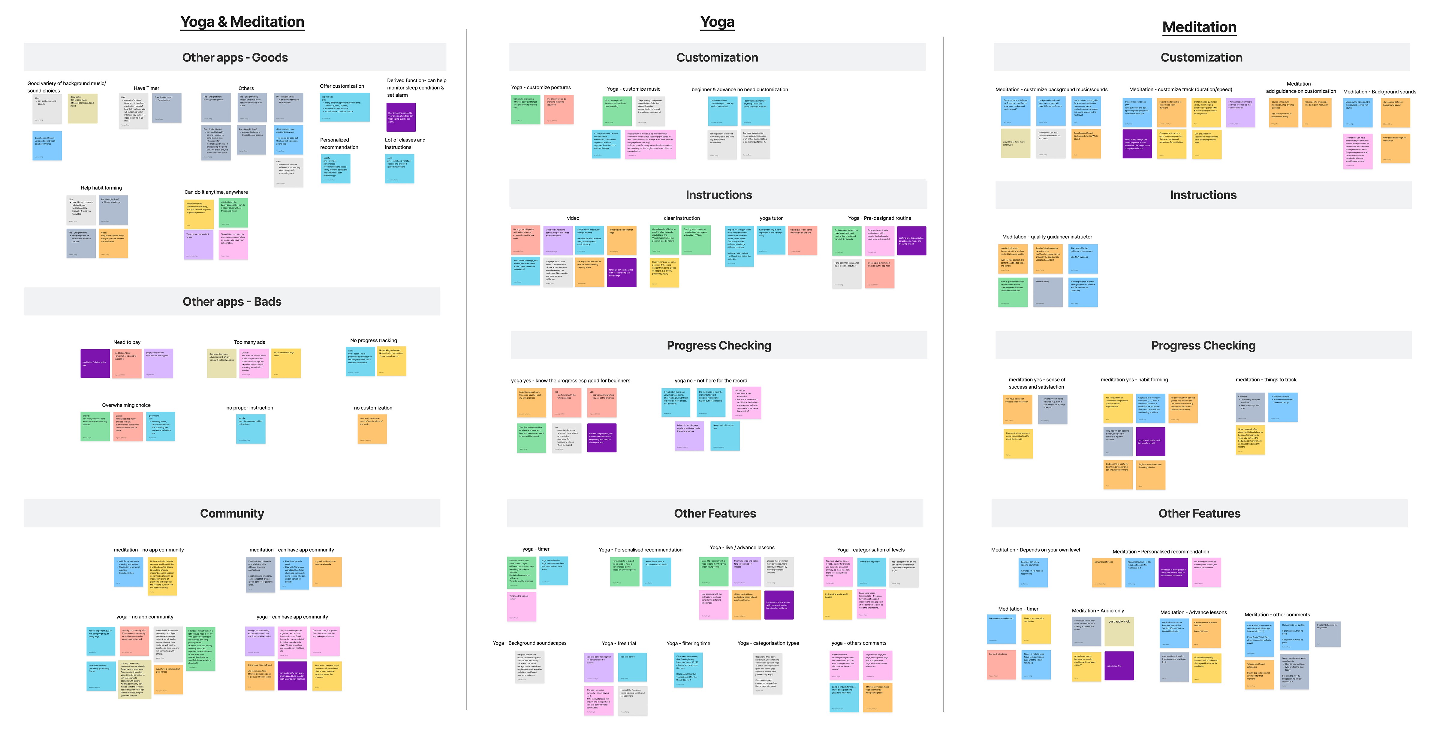
Affinity Map
The Affinity Map is categorized into three main sections: Yoga and Meditation, Yoga, and Meditation. Under Yoga and Meditation, smaller categories include the pros and cons of other apps and insights from the community. For Yoga and Meditation individually, aspects such as customization, instructions, progress tracking, and other features are thoroughly examined.
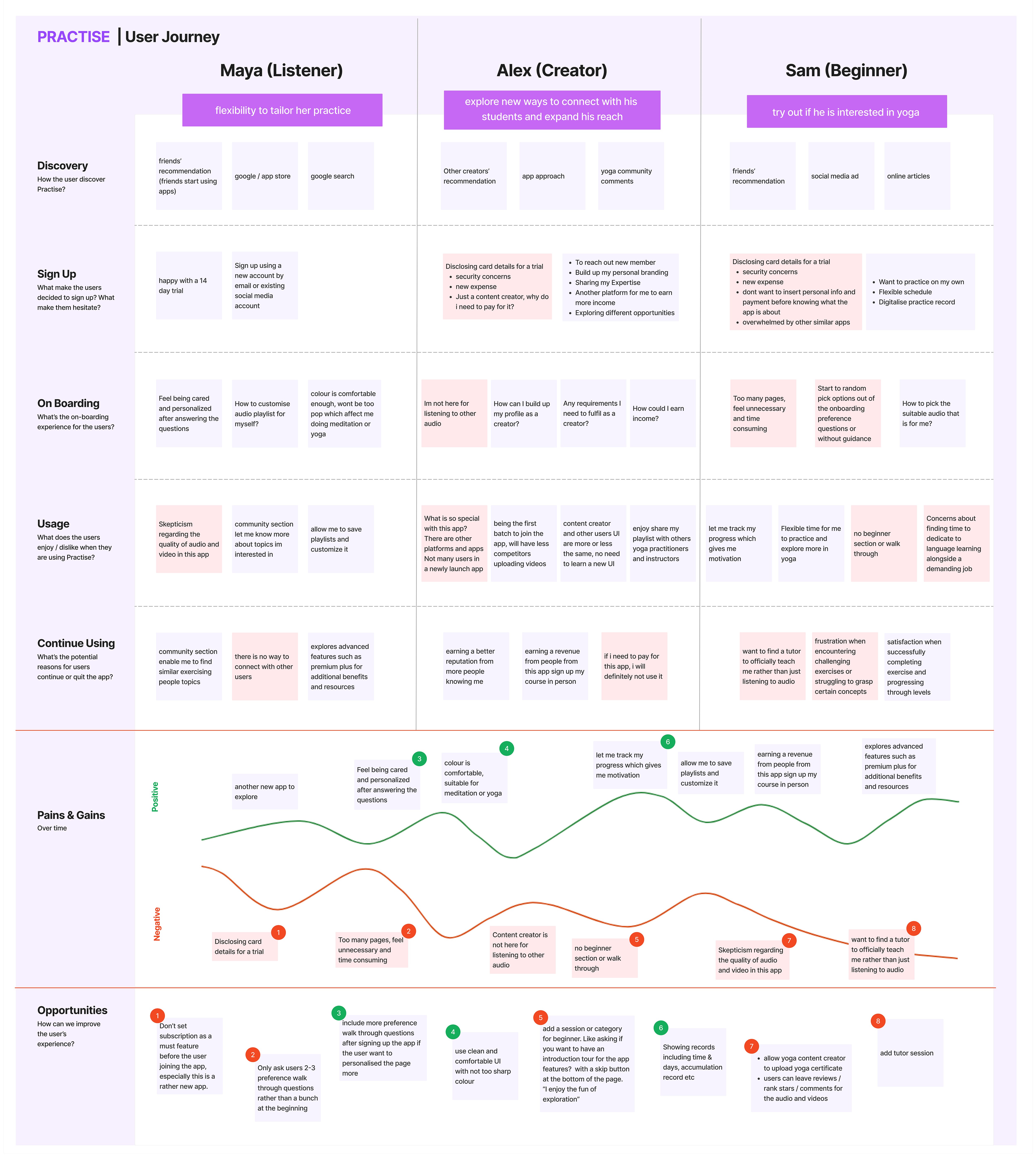
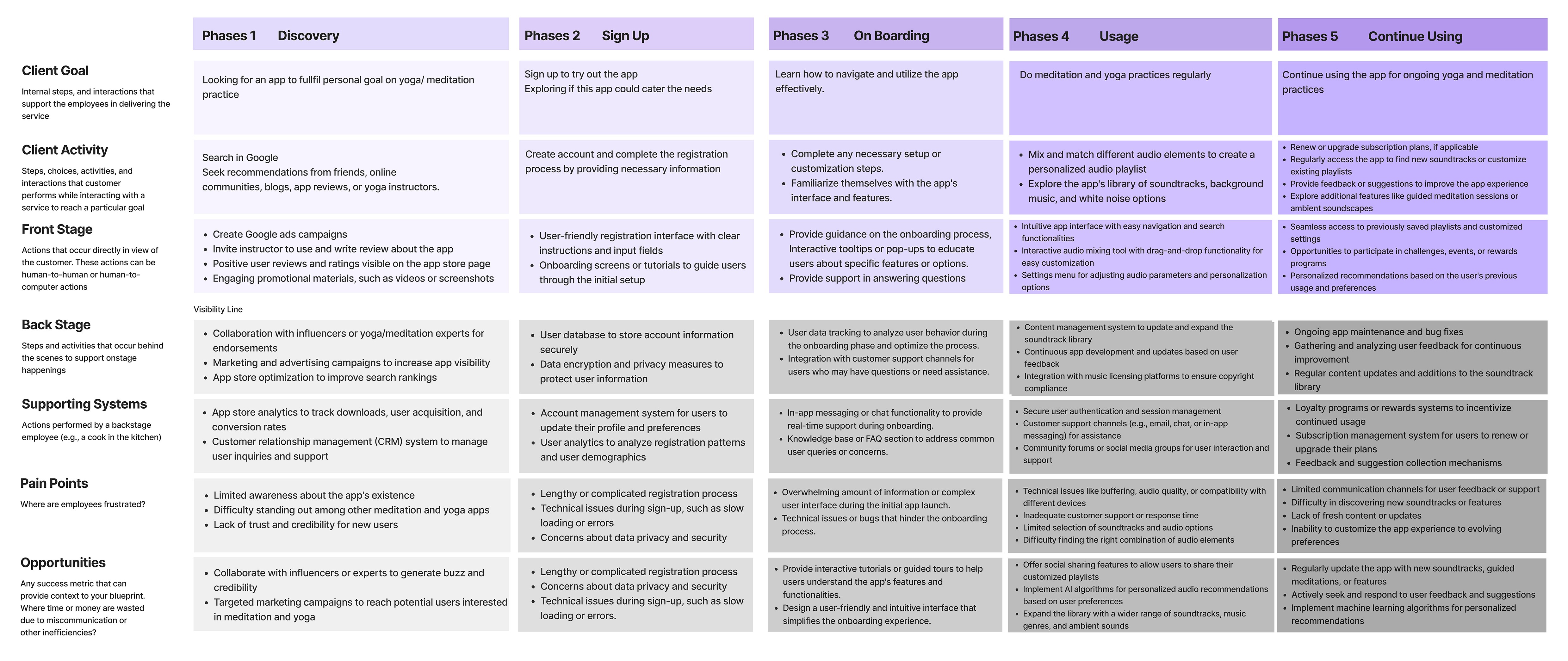
User Journey Map
We’ve divided the journey map into three personas: Listener, Creator and Beginner & 5 stages: Discovery, Sign Up, On Boarding, Usage and Continue Using. The 4 key pain points fall into the On Boarding, Usage and Continue Using.
Key Insights from the Affinity Map, User Journey Map
Yogist
Customization preferences: music, audio sequence, and postures
Pre-designed videos with clear instructions is preferred
Mixed opinion on progress checking
Varied interest in personalized recommendations
Desire for categorization options: levels, yoga types, and filtering time.
Meditationists
Customization preferences: background music, pace, effects, and guidance.
Users consider the timer essential
No need for personalized recommendations
Appreciation for mood check-in
Content preference: audio sufficient, without needing additional images or videos
Yogist & Meditationists
Familiarity with popular apps like "Calm" and "Insight Timer."
Preference for simplicity and avoiding overwhelming options.
Importance of habit-forming tools and consistent practice.
Dislike for ads and mandatory payments; preference for free trials.
Emphasis on tutor quality and willingness to pay for advanced lessons.
Value in showing badges and records, and preference for social sharing features.
Service Blueprint
To address the pain points identified in the problem statements, we took a holistic approach by creating a service blueprint that envisioned an improved ecosystem to enhance customer experience.
We then focused on developing the requested main deliverable, starting with user flow and low fidelity prototype, we gradually refined our design, eventually reaching a high fidelity interactive prototype. Alongside this, we established a comprehensive design system to ensure consistency and efficiency throughout the project. Importantly, we continuously tested our prototype at each stage of the prototyping process.
Business Goal
Business Direction
Stage 1: Gain more users
Free for all features, for data collection and and gain users
Stage 2: Freemium
Freemium: Preview lessons, initial customization options.
Premium: Full lessons, advanced customization (after prolonged use)
Stage 3: Live and advance lessons
Pay for live and advance lessons. “PRACTICE” Collaborate with renowned yoga teachers or meditation experts for exclusive content
3 Core Features (Stage 1 - 3)
1. Freemium
Free to use, paid to have premium features, no ad in app
2. Customization
Mix and match soundtracks, add background music/ white noise
3. Community & habit-forming tools
Provide badge and challenges for users to reach their goals
User Flow Diagram
Designing for the user experience began from sketching out a typical user journey based on the accomplishment of specific tasks within the app. Once the user journey had been established, we began to unpack the design flow for general and specific use cases.
Connect to Content
Add layers or components to make infinite auto-playing slideshows.
Design System (Extracted)
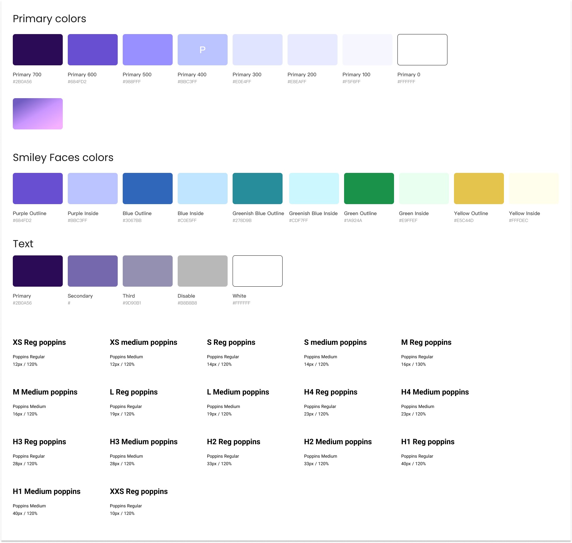
A design system was created for each operating system incorporating the set of visual elements like colour, typography and UI components.
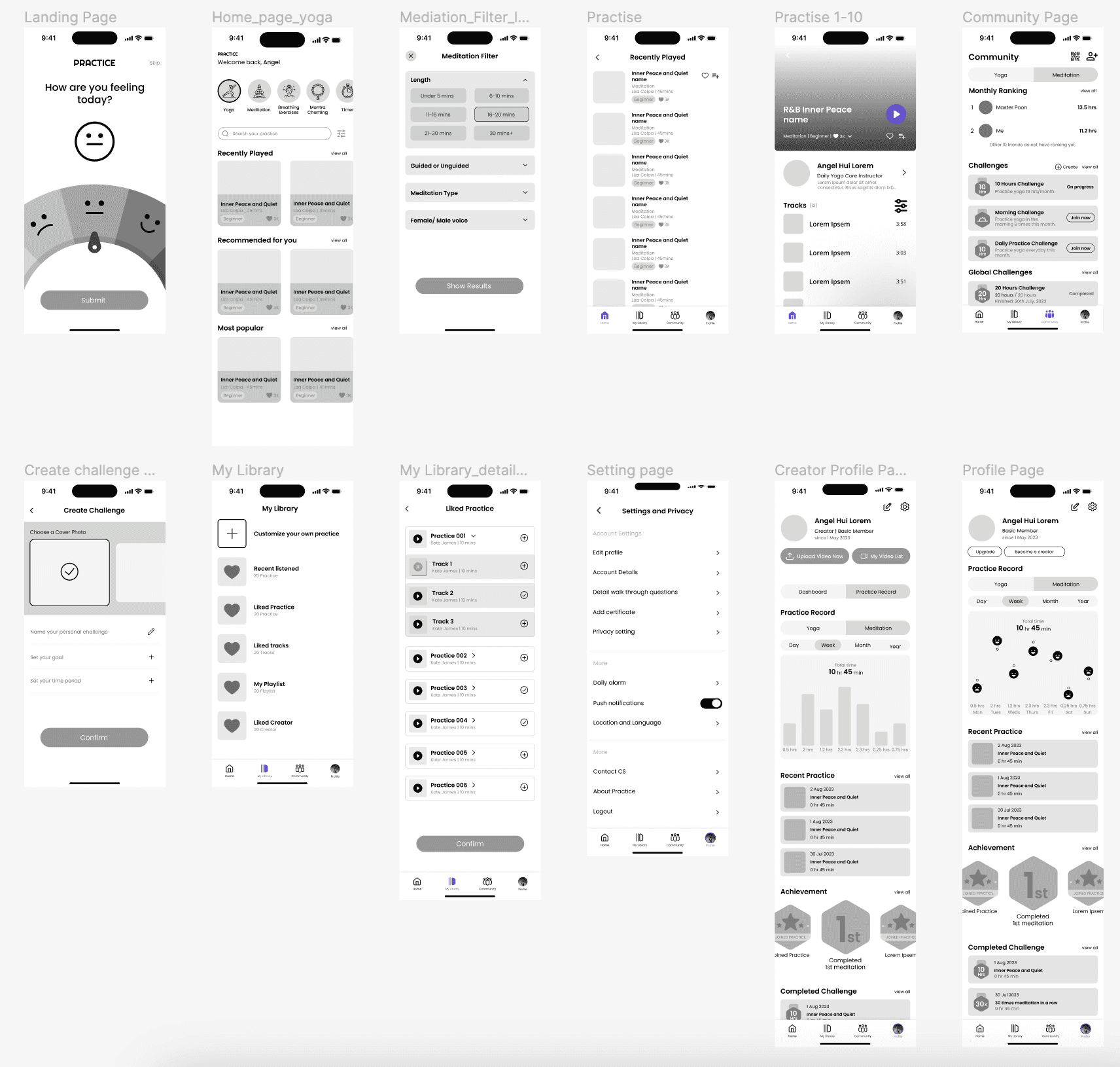
Lo-fi Wireframe
The Low fidelity prototypes helped us take the sketches to a next level but a step before the high-fidelity mockups. Below only shows a few screens.
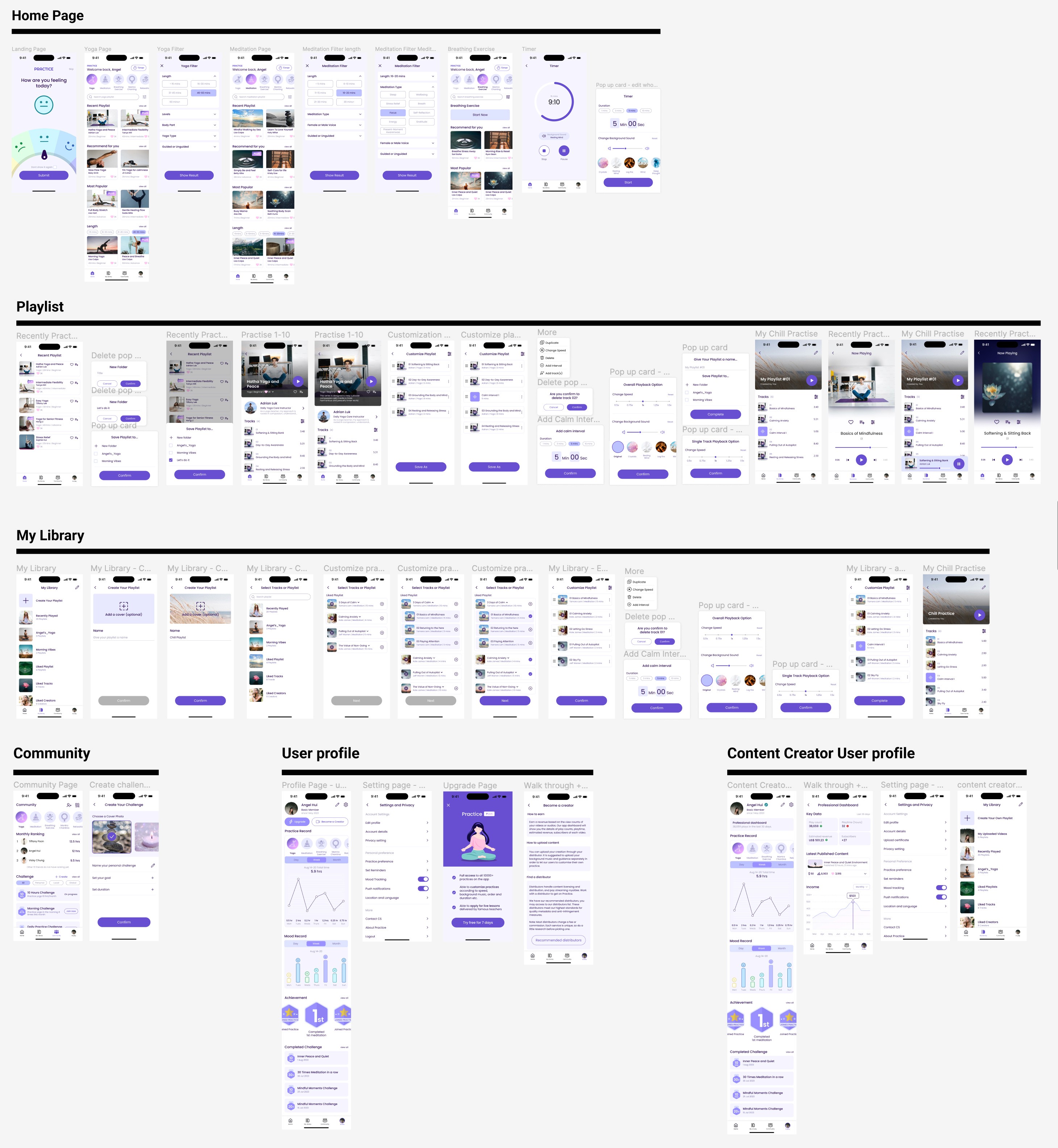
MVP
Usability Tests
Tasks:
Home page navigation
Timer setting
Create playlist, add to playlist and customize playlist ability
Community page navigation
Profile page navigation (incl. user and creator side)
Details
Total sessions:
5
Interviewees:
3 yogist
2 meditationists
Connect to Content
Add layers or components to make infinite auto-playing slideshows.
Final Design Preview
Final Thoughts
There are a few things I learned from this project. Each founder has their own ideas on how to progress their company's ideas. Even if you don't agree with specific features, you still need to find a way to make them happen.
Additionally, this project gave us the opportunity to work on the service blueprint, which sparked my interest in service design. UI/UX is just a small part of design, but the service blueprint focuses on the bigger picture and the importance of each step for individuals in their roles. It clearly identifies pain points, opportunities, and what is needed at each step. It's crucial to establish clear business goals and main features from the beginning, as it sets the foundation for everything.
Furthermore, I spent time discussing the roles with the tutor, particularly the role of the creator in the app. Without creators, no videos would be uploaded to the platform, rendering the app non-functional. So, I included the creator's perspective in the user journey map. However, since we only interviewed yogists and meditationists and didn't include any creators, it was suggested that the creator's angle shouldn't be included on the map. Some of the points on the user journey map were hypothetical.
From my perspective, if we have more time in the future and can interview creators, we should include concrete thoughts on their role.
In the end, we did manage to incorporate the part about how the creator links up with other platforms like Spotify, which aligned with the client's expectations. I'm glad we dedicated time to understanding the entire user flow and ultimately developed the UI.
Up Next
Hollo:
Empowering Cancer Patients with Support and Comprehensive Resources
Hollo:
Empowering Cancer Patients with Support and Comprehensive Resources
© Copyright Hui Sze Wai 2023
© Copyright Hui Sze Wai 2023