Xccelerate Capstone Project
Xccelerate Capstone Project
Hollo:
Empowering Cancer Patients with Support and Comprehensive Resources
Hollo:
Empowering Cancer Patients with Support and Comprehensive Resources
Overview
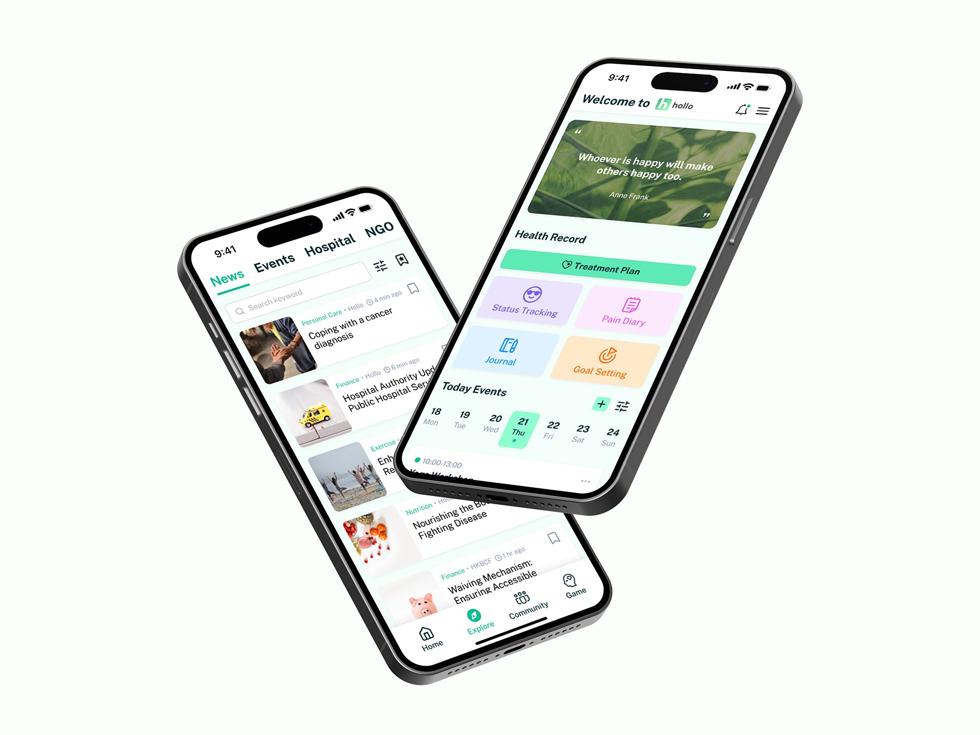
The Hollo app is a result of in-depth research conducted to address the specific needs of cancer patients. Through assessment and a thorough competitive analysis of existing cancer patient apps, we have gained valuable insights into the priorities, challenges, and requirements of this user group. Leveraging this research, we are developing an intuitive and user-friendly app interface that encompasses a wide range of comprehensive features.
The Hollo app is a result of in-depth research conducted to address the specific needs of cancer patients. Through assessment and a thorough competitive analysis of existing cancer patient apps, we have gained valuable insights into the priorities, challenges, and requirements of this user group. Leveraging this research, we are developing an intuitive and user-friendly app interface that encompasses a wide range of comprehensive features.
My Role
In the initial stages, my teammates (Tiffany Poon, and Michael Chu,) and I established project deliverables, timeline, and UX artifacts with a focus on a user-centered design process.
During the research phase, we conducted secondary research, planned and conducted user interviews, and created personas. Affinity mapping was also facilitated.
Moving into the define phase, my focus was on understanding business goals while considering user needs. This involved developing a sitemap, user flow, and core app features.
In the design phase, I prioritized wireframing for the explore section and hamburger menu, structured content, and created high-fidelity designs and interactive prototypes.
User feedback was incorporated throughout the iterations of the minimum viable product (MVP).
Objective
Build patient-centric prototypes
Refine through user testing and feedback
Generate high-fidelity prototypes for Hollo to launch in the coming year
Provide valuable resources to free users, promoting consideration of paid intervention services
Build patient-centric prototypes
Refine through user testing and feedback
Generate high-fidelity prototypes for Hollo to launch in the coming year
Provide valuable resources to free users, promoting consideration of paid intervention services
Project Flow at a Glance
Research
Research
Define
Define
Ideate
Ideate
Refine
Refine
Usability Test
Usability Test
Questions to clarify with the client
Before conducting initial research, the client provided us with a substantial amount of resources. After thoroughly reviewing these materials and providing comments, our team formulated several questions to seek clarification from the client. These questions primarily focused on five different aspects:
Requesting information about the current app, if available.
Seeking clarification on the meaning of certain professional terminology.
Clarifying our work direction to ensure alignment with the client's expectations.
Gathering general information such as the target audience and any initial ideas from the client, to ensure we are heading in the right direction.
Inquiring about any additional features that should be included or excluded from the project.
User Interviews
Objectives
Need for emotional support throughout the cancer journey
Exploring existing support methods and challenges
Identifying helpful resources for patients and families
Need for emotional support throughout the cancer journey
Exploring existing support methods and challenges
Identifying helpful resources for patients and families
Tasks
Answer approximately 6 questions about managing the profile, 9 questions about exploring cancer-related information, 13 questions about social support (forum+support group), 4 general questions depending on time and share any additional information they would like to contribute
Answer approximately 6 questions about managing the profile, 9 questions about exploring cancer-related information, 13 questions about social support (forum+support group), 4 general questions depending on time and share any additional information they would like to contribute
Details
Total sessions
5
5
Interviewees
4 female
1 male
4 female
1 male
Interview Questions
About managing the profile
About managing the profile
How do you currently keep track of your cancer-related information, such as your diagnostic information, treatment plan, and appointments?
What challenges or difficulties have you encountered in managing and organising this information?
Would you like to manage / check these things / solve these difficulties in an APP?
IF YES, what specific / must add information would you like to see included in the treatment plan section to ensure it provides a comprehensive overview of your journey?
About exploring cancer-related
About exploring cancer-related
How do you currently browse information about your own treatment advocacy? (e.g. source from websites, books, healthcare providers)
What types of cancer-related information do you find most valuable or important to have access to?
Do you have difficulties in finding relevant and trustworthy information about cancer treatments or related events? (e.g. You find different websites talking about different info. You cannot find the info you want...)
About social support (forum+support group)
About social support (forum+support group)
Did the doctors recommend any support groups or other resources for managing your recovery?
Any difficulties have you encountered when you tried to seek for emotional support? (e.g. feeling not understand by others, could not or afraid to find a person to talk to, hard to express freely about the problems you are facing)
If we have matching support groups, caregivers, or peer mentors feature in our app, what criteria or preferences would you consider important in this matching process?
Have you participated in any support groups before or would like to join any in the future?
IF YES, what are your experiences? - classes, workshops, info sessions, Do you have any chance to share story with others?
Affinity Map
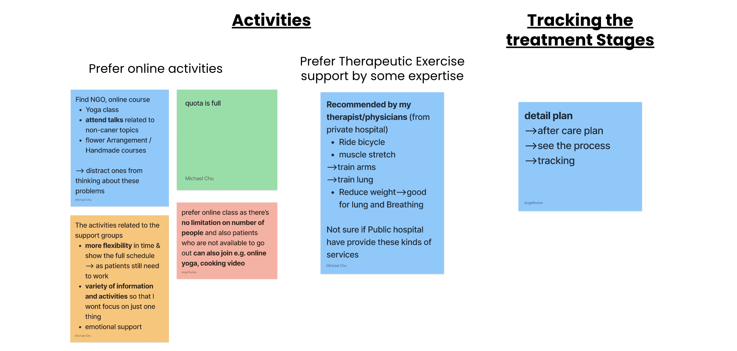
The cancer patients' comments have been classified into five categories, including:
Browsing information
Difficulty in seeking other support
Platform to connect with other cancer patients and experts
Activities
Tracking treatment process
The cancer patients' comments have been classified into five categories, including:
Browsing information
Difficulty in seeking other support
Platform to connect with other cancer patients and experts
Activities
Tracking treatment process
Persona
We created two personas to understand cancer patients needs and pain points. Detailed profiles for each persona helps us design solutions that address their specific needs, resulting in a more user-centered platform.
Cancer patient with a stable condition
Cancer patient in a treatment stage
We created two personas to understand cancer patients needs and pain points. Detailed profiles for each persona helps us design solutions that address their specific needs, resulting in a more user-centered platform.
Cancer patient with a stable condition
Cancer patient in a treatment stage


Pain Point
The cancer information is outdated and fragmented
Insufficient assistance available for those seeking emotional support
A limited number of channels available for cancer patients to connect with both fellow patients and experts in the field
A lack of flexibility in participating in activities, as well as a deficiency in the recommendation of therapeutic exercises by the experts
App Core Features
After gaining an understanding of the needs and desires of cancer patients, as well as the client's desired features, we have established four main features with additional smaller features under each one.
After gaining an understanding of the needs and desires of cancer patients, as well as the client's desired features, we have established four main features with additional smaller features under each one.
User Profile
Daily quote for inspiration and motivation.
Treatment plan overview, including timeline, choices, and a guide for the next steps.
Calendar for tracking records, such as health data, gaming activities, and doctor appointments.
Hamburger menu
Explore
Detailed information, news, and links about different treatments, opportunities and tips , educational resources, nutrition, lifestyle etc.
Events and seminars related to cancer and mental health, as well as non-cancer events like drawing classes or city exploration.
Hospital & NGO details
Forum & Groups
Creation of posts and sharing success stories
Commenting and engaging in discussions on a wide range of cancer-related topics
Joining specific groups to share stories, experiences, and challenges
Group chats, video calls, and scheduled virtual meetups for connecting with others
4. Consultation
Matching with cancer survivors and medical experts for online consultations and support
Message or schedule meet up or calls with them
Information Architecture

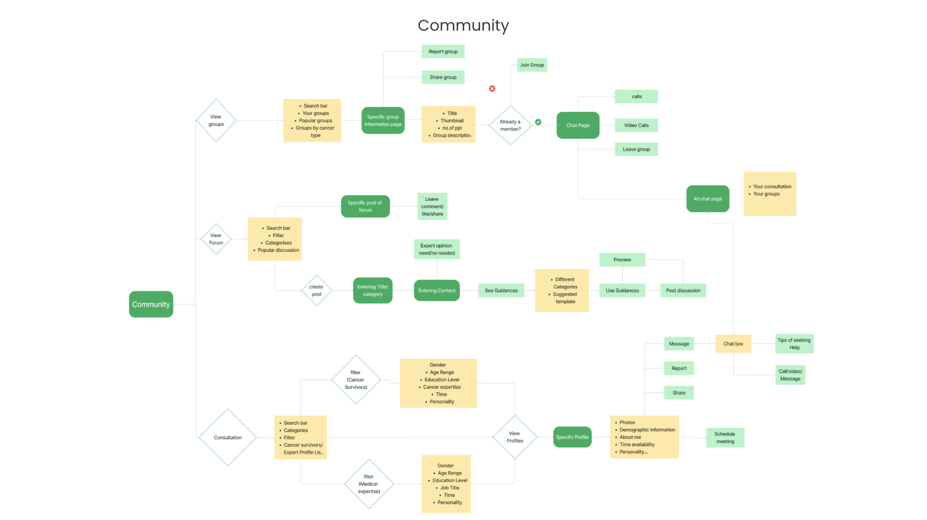
User Flow Diagram
Designing for the user experience began from sketching out a typical user journey based on the accomplishment of specific tasks within the app. Once the user journey had been established, we began to unpack the design flow for general and specific use cases.
Designing for the user experience began from sketching out a typical user journey based on the accomplishment of specific tasks within the app. Once the user journey had been established, we began to unpack the design flow for general and specific use cases.
UI References
During the design phase, we conducted extensive online research to gather UI references for each feature. After careful consideration, we selected the most crucial references that would be incorporated into our low-fidelity designs.
During the design phase, we conducted extensive online research to gather UI references for each feature. After careful consideration, we selected the most crucial references that would be incorporated into our low-fidelity designs.

Design System
A design system was created for each operating system incorporating the set of visual elements like colour, typography and UI components.
A design system was created for each operating system incorporating the set of visual elements like colour, typography and UI components.

Icons
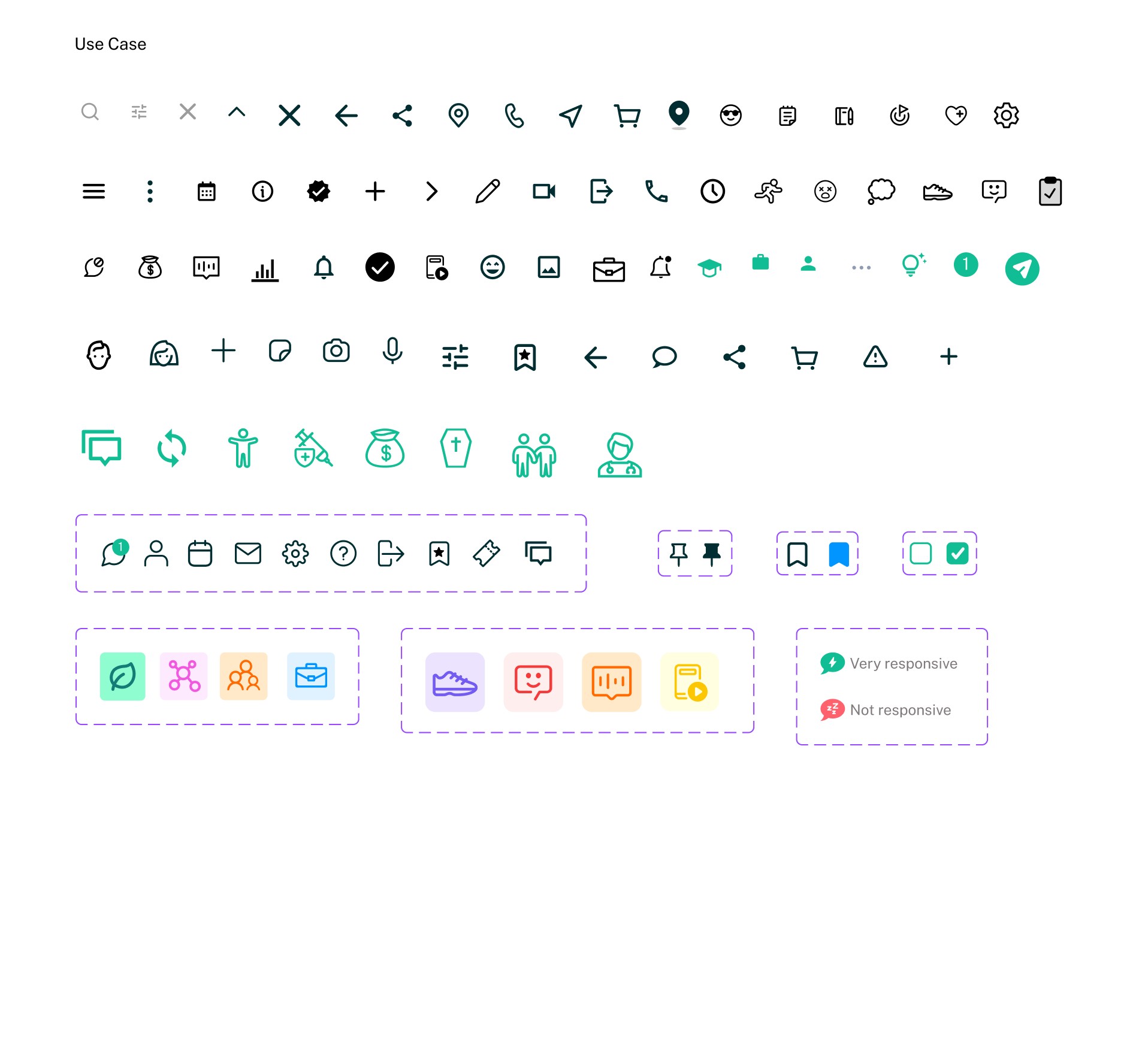
A design system was established for each operating system, incorporating essential visual elements like color, typography, and a carefully curated set of icons.
A design system was established for each operating system, incorporating essential visual elements like color, typography, and a carefully curated set of icons.


Components
A comprehensive component library was created, consisting of various UI elements such as buttons, and navigation components, ensuring consistency and usability throughout the interface.
A comprehensive component library was created, consisting of various UI elements such as buttons, and navigation components, ensuring consistency and usability throughout the interface.

Lo-fi Wireframe
The Low fidelity prototypes helped us take the sketches to a next level but a step before the high-fidelity mockups. Below only shows a few screens.
The Low fidelity prototypes helped us take the sketches to a next level but a step before the high-fidelity mockups. Below only shows a few screens.
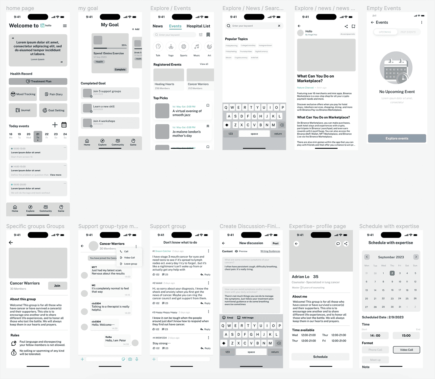
MVP

Final Design Preview
Final Thoughts
This is a project where the client has been highly involved. Our team is grateful that Cameron has shared their team's original and comprehensive research. I have learned a lot by gathering ideas from previous research and conducting further interviews. It has been an amazing journey to brainstorm innovative ideas for a comprehensive app targeting a specific audience. This experience has broadened my perspective not only for this particular audience but also for future clients, providing different angles to explore the possibilities.
However, one challenge we faced was time management. With only three members in our group, we dedicated too much time to developing numerous features without prioritizing the most important ones. While the app is comprehensive for cancer patients, we unfortunately didn't have enough time to conduct usability tests and ensure that the target audience is satisfied with the solution.
Initially, we identified that the majority of cancer patients fall within the age range of 40-60. I even confirmed with the client if the app would be suitable for this age group. However, since we were following the client's ideas, we ended up trying to incorporate everything. In the future, if time permits, I will prioritize selecting a few key features and focus on developing them, and work on the usability test.
Up Next
PRACTICE:
Personalized Wellness App Empowering Creators and Listeners for Enhanced Well-being
PRACTICE:
Personalized Wellness App Empowering Creators and Listeners for Enhanced Well-being
© Copyright Hui Sze Wai 2023
© Copyright Hui Sze Wai 2023


