Xccelerate project 1
My Helper:
Empowering Darmax Global Staff with Streamlined Management and Effortless Updates
Overview
Streamlined Job Management for Darmax Global Staff. Our dedicated application utilizes efficient data management to provide an intuitive and user-friendly interface for administrators. They can easily manage and track job postings and interview bookings, saving time and ensuring a smooth process. We also enhance the experience for helpers and employers by automating routine updates, making it effortless for them to stay informed.
Project Type & Involvement
work for My Helper - User Research, UI Design
Timeline
27th June - 29th July 2023
Platform
Desktop
My Role
Collaborated with coursemates at Xccelerate to develop initial questions for clients, focusing on company background and goals.
Worked with teammates (Keris Cheng, Michael Chu, and Tiffany Poon) to create user flow, feature list, and overall logic.
Collaborated on developing low-fidelity wireframes.
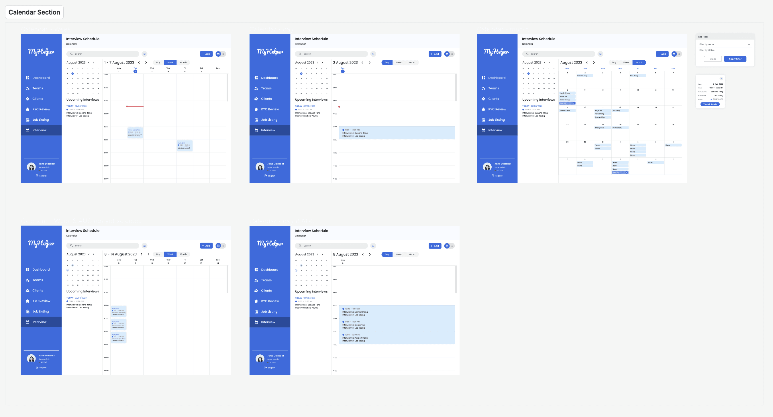
Took a leading role in designing the schedule calendar section and contributed to overall prototype development.
Conducted usability tests and made necessary adjustments based on feedback.
Presented findings and successfully implemented recommended changes.
Project Flow at a Glance
Research
Define
Ideate
Refine
Usability Test
Prototype
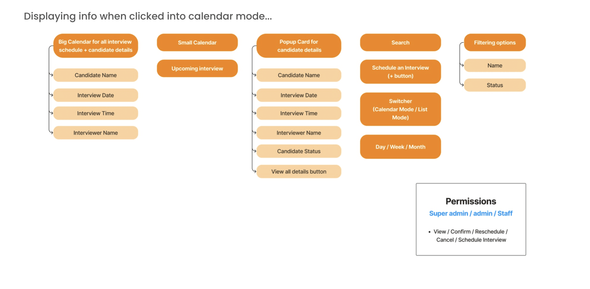
Information Architecture
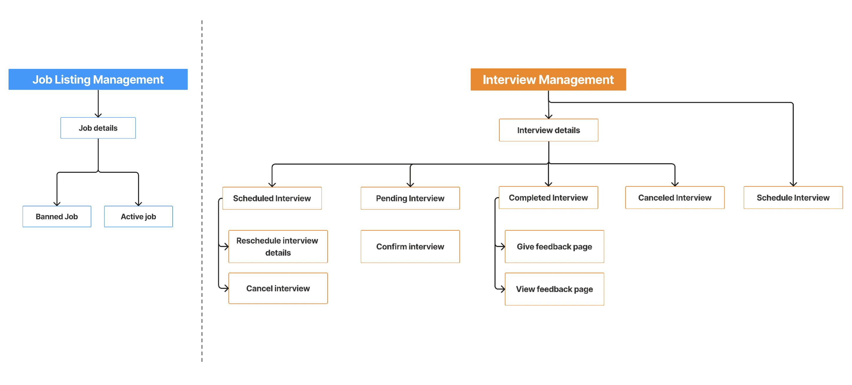
User Flow Diagram
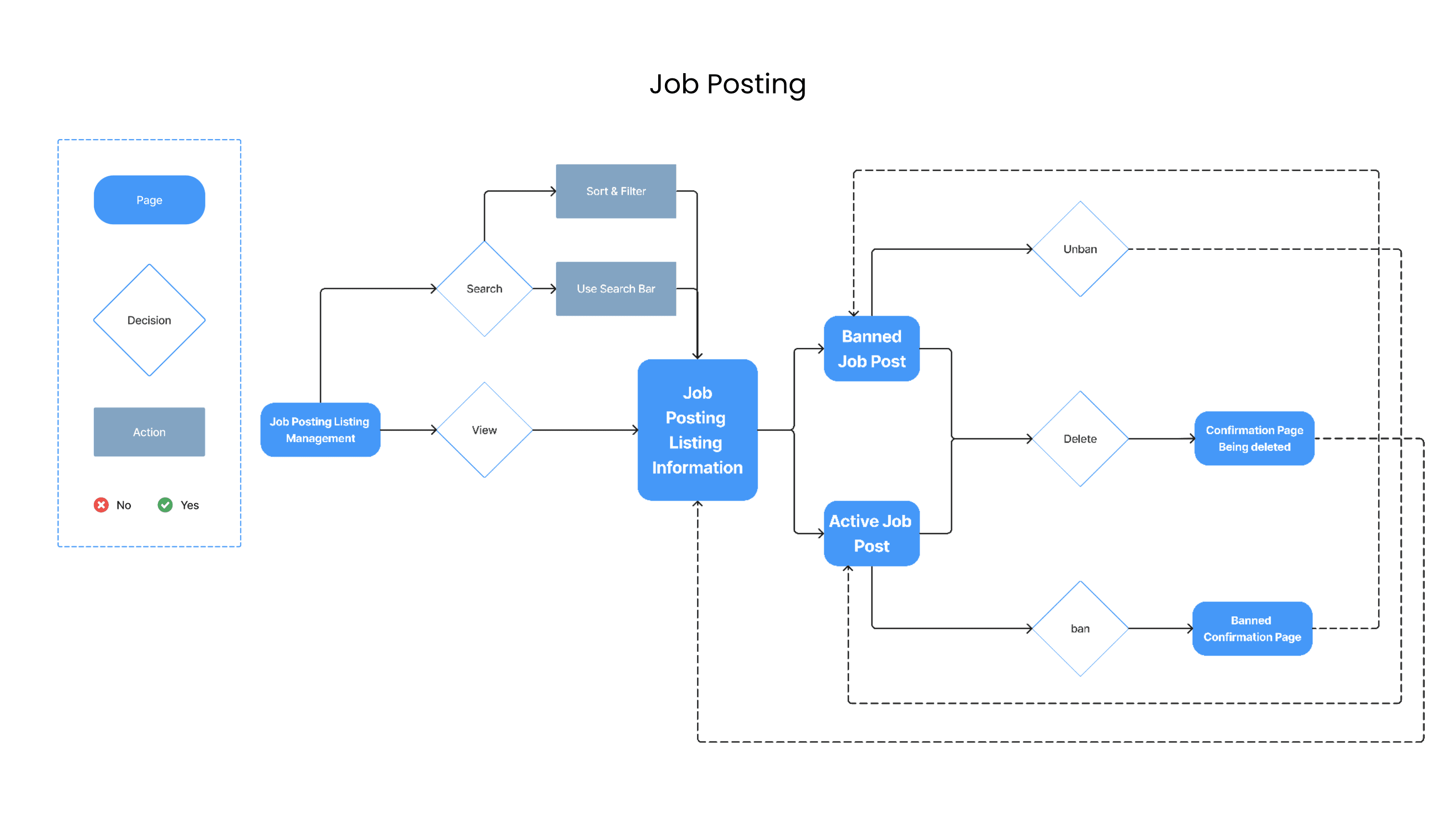
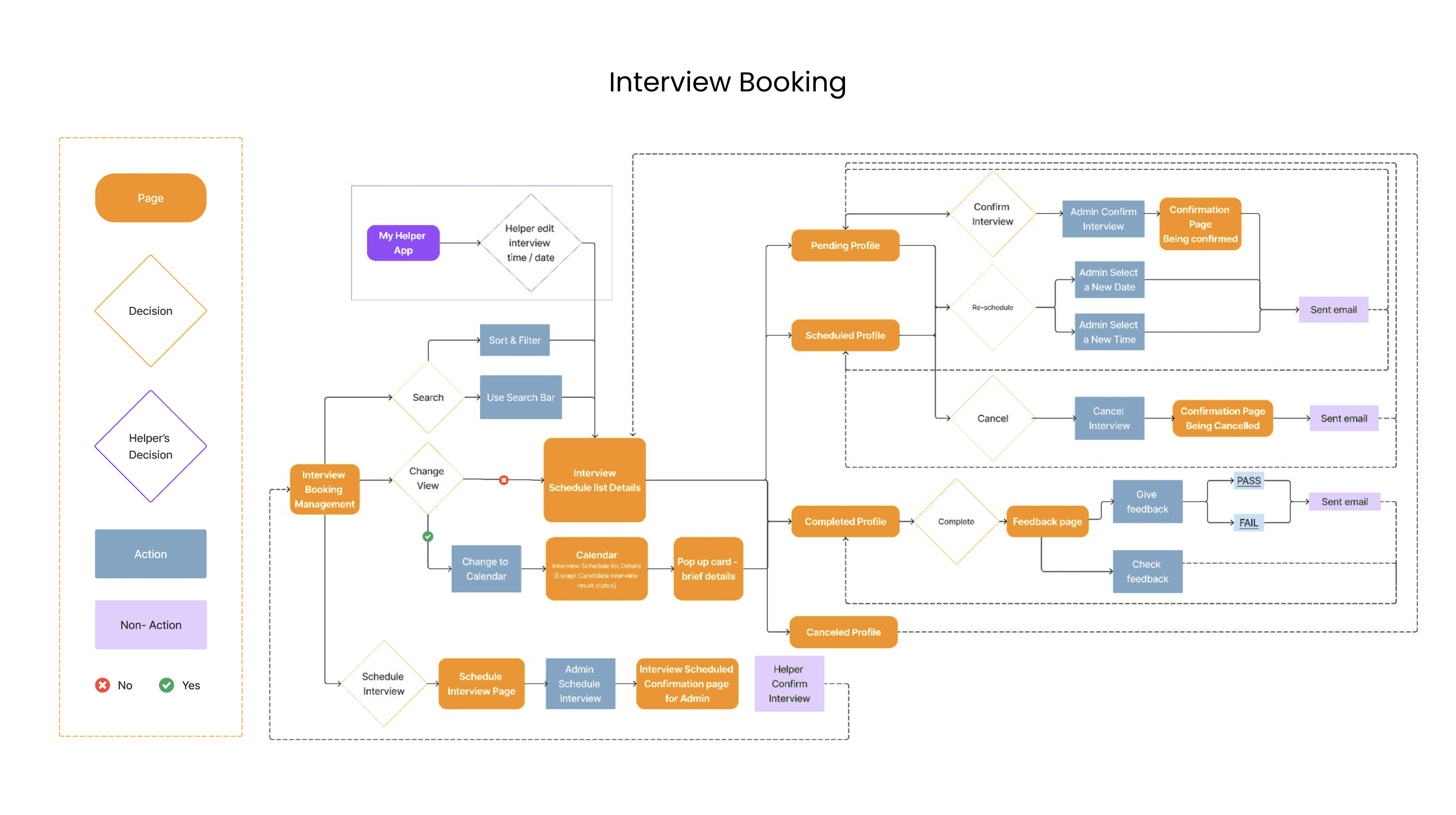
Designing for the user experience began from sketching out a typical user journey based on the accomplishment of specific tasks within the app. Once the user journey had been established, we began to unpack the design flow for general and specific use cases.
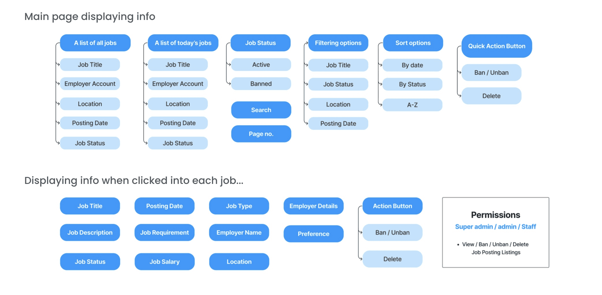
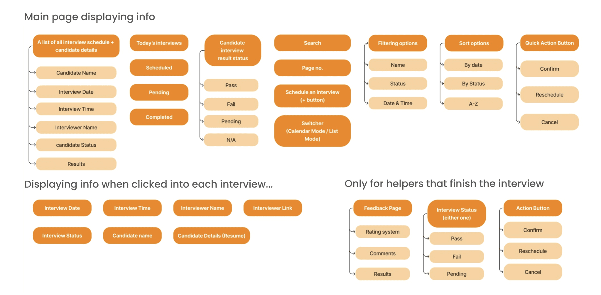
Feature List
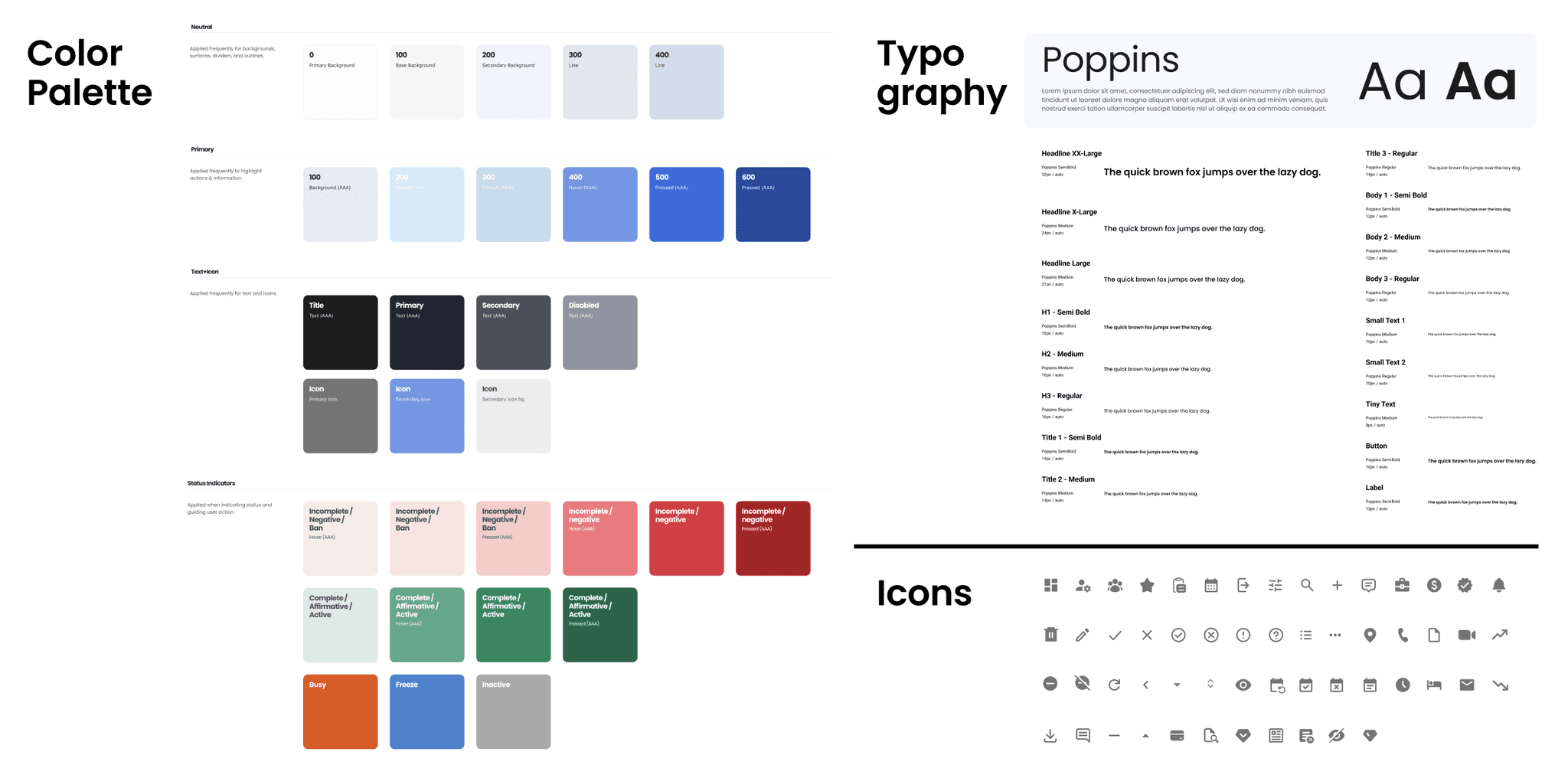
Design System (Extracted)
A design system was created for each operating system incorporating the set of visual elements like colour, typography and UI components.
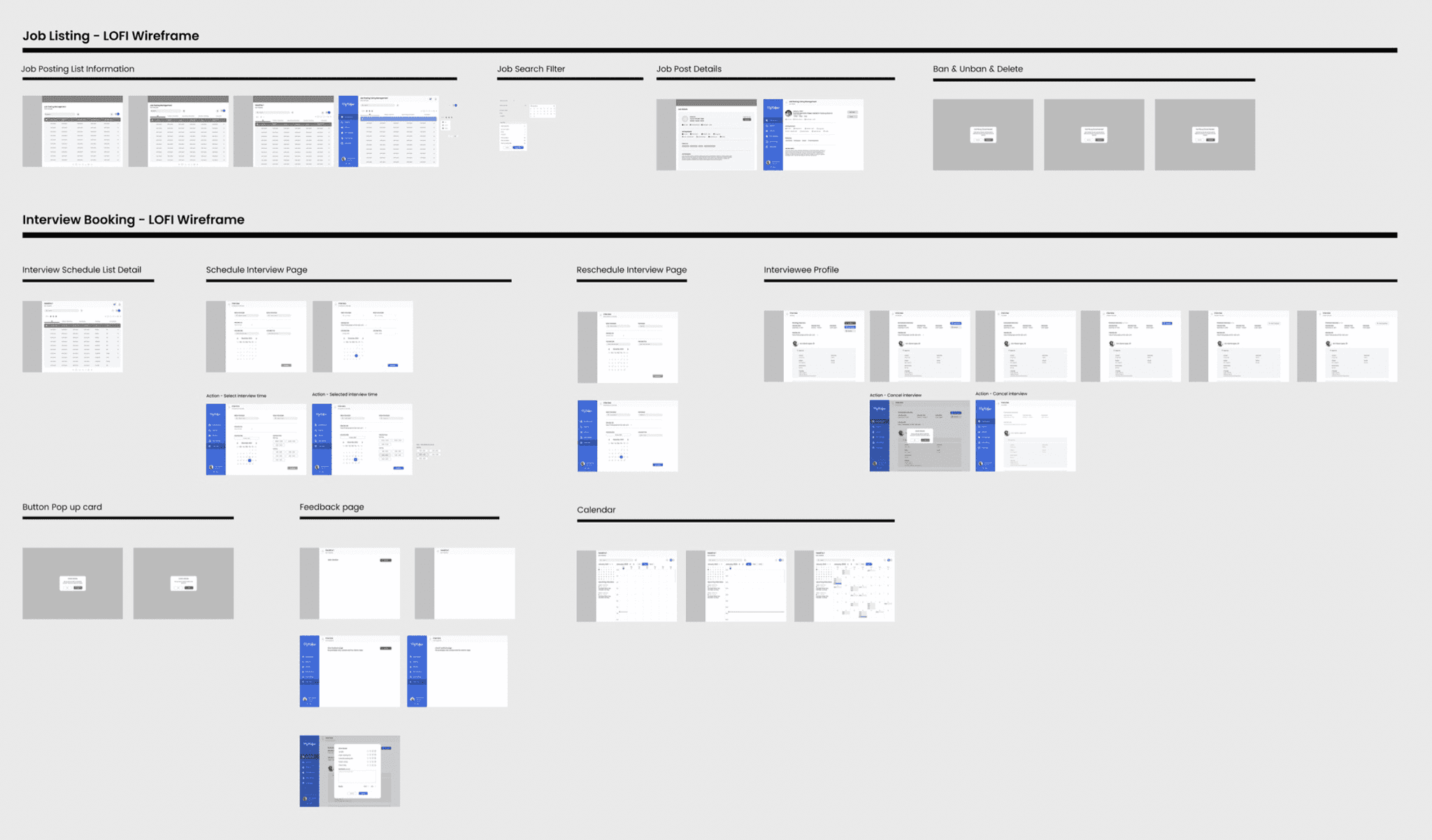
Lo-fi Wireframe
The Low fidelity prototypes helped us take the sketches to a next level but a step before the high-fidelity mockups. Below only shows a few screens.
MVP
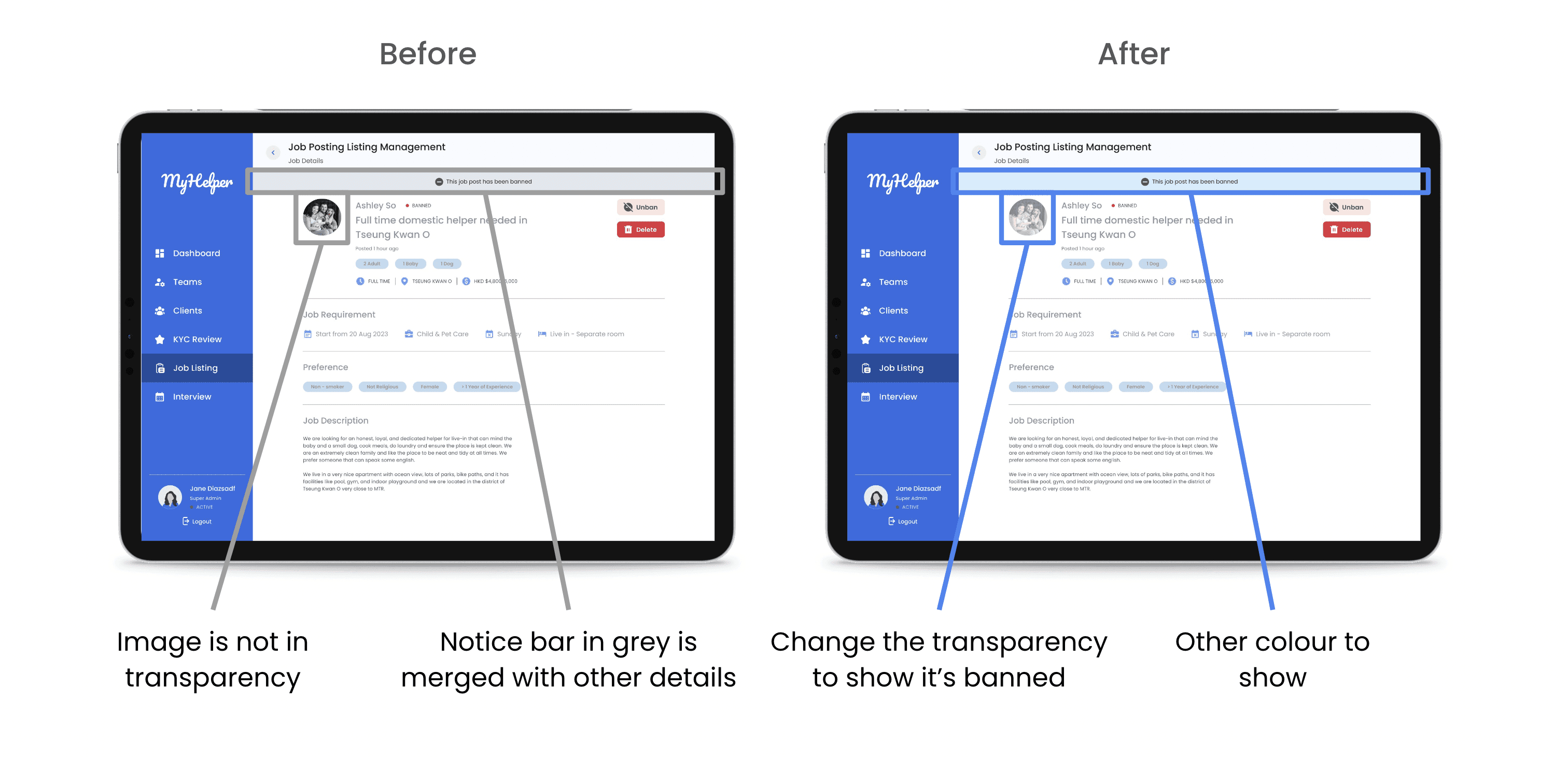
Below are example screens from the first hi-fi iteration. These were further changed, according to usability tests findings in below section.
Usability Tests
Tasks:
View a job post and ban it. Then try using the quick action function to unban the post
Schedule a new interview and give feedback for a pending result profile
Switch to the calendar mode and view the interview details
Details
Total sessions:
16
Interviewees:
14 users have NOT used similar products before
2 users have used similar products
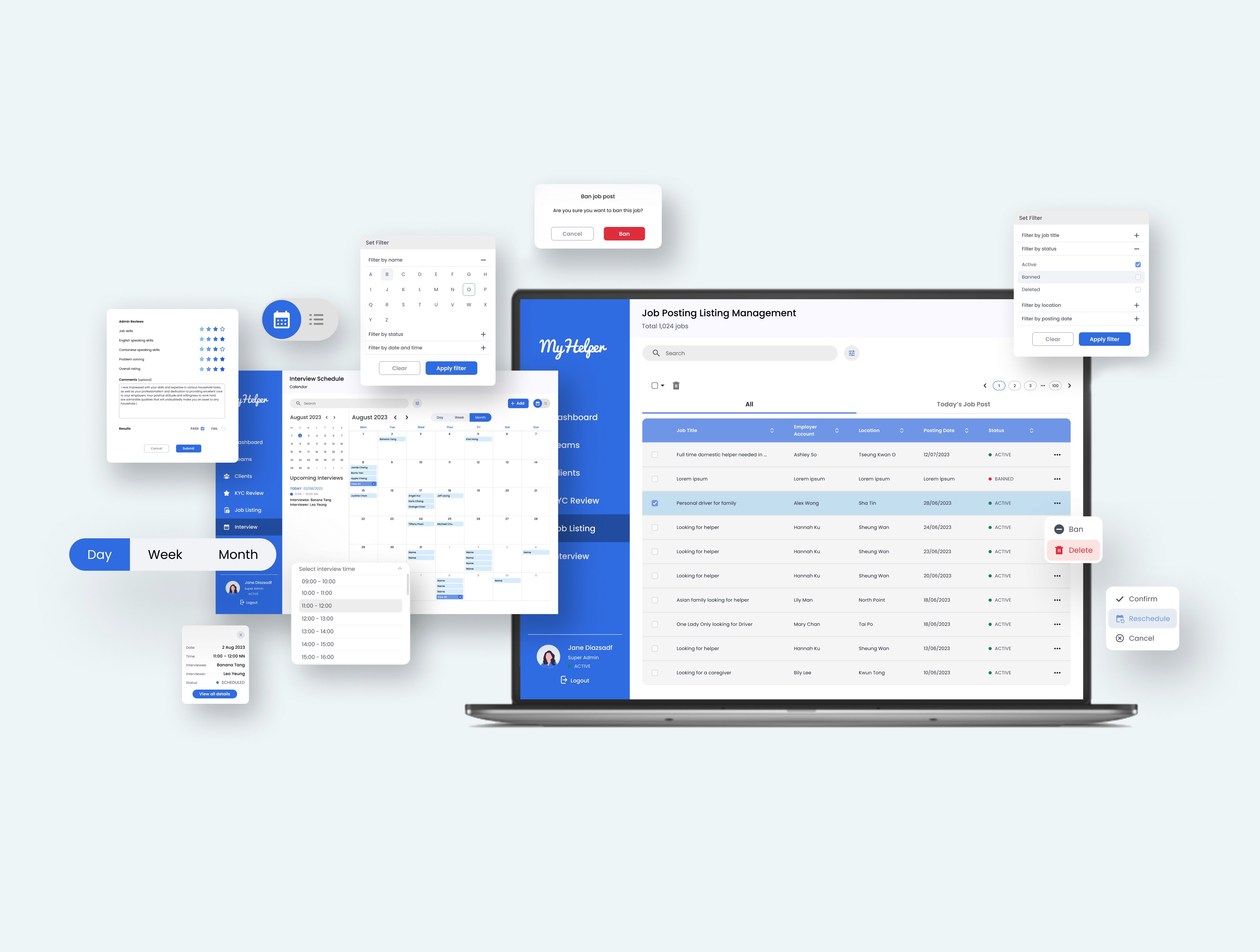
Final Design Preview
What I Have Learnt
In my experience working on my first client project with Xccelerate, I've learned that not all clients have a clear direction for their projects. Despite providing a comprehensive set of questions to ensure we were on the right track, there were still uncertainties. One particular challenge arose when determining the device for which we should design the final product. The client initially indicated a preference for a mobile-only viewport, which seemed unusual considering most Content Management System (CMS) platforms are desktop-focused. However, we followed the client's direction and started developing for the mobile viewport. Later on, it became apparent that the focus should have been on the desktop instead. Although it would have been beneficial to stand firm in our position at the first place and convince the client of the correct direction. It's important to learn from these experiences and find ways to effectively communicate and avoid wasting time on unnecessary changes.
Besides, we conducted remote sessions using Zoom with client users. Since we were testing a prototype rather than an MVP or a fully developed product, it was challenging for users who were unfamiliar with the Figma tool. From this, we learned the importance of providing clear instructions to users, avoiding excessive directions and technical jargon to simplify the process.
In addition to Zoom usability testing, we utilized a platform called "Maze" to upload tasks and share the link with users outside of the client base. This allowed us to gather a diverse range of results and statistics. However, after our presentation, we received feedback advising against sending tasks to unrelated individuals, particularly those with technical and design backgrounds. Their comments may not align with the perspective of the general public, which is our target audience.
Overall, these experiences have taught us the significance of clear communication, simplicity in instructions, and ensuring that the testing process aligns with the intended audience.
Up Next
Lobahn Connect™:
Revolutionizing Talent Matching and Recruitment Dynamics
© Copyright Hui Sze Wai 2023
